

Blog
Insights, updates and stories from our team
All categoriesComparison5Font Basics2Font Formats2Font Use3General1Guide2Preparation5Privacy and Rights1Troubleshooting8Use Cases4
Font Basics2026/07/27
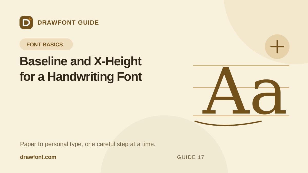
Baseline and X-Height for a Handwriting Font
Use baseline, x-height, cap height, ascenders, and descenders to stop handwritten glyphs from floating or changing size unpredictably.
Comparison2026/07/27
How to Compare Handwriting Font Generators
Compare photo tools, printable templates, drawing apps, and font editors by source material, correction controls, privacy, and output format.
Preparation2026/07/27
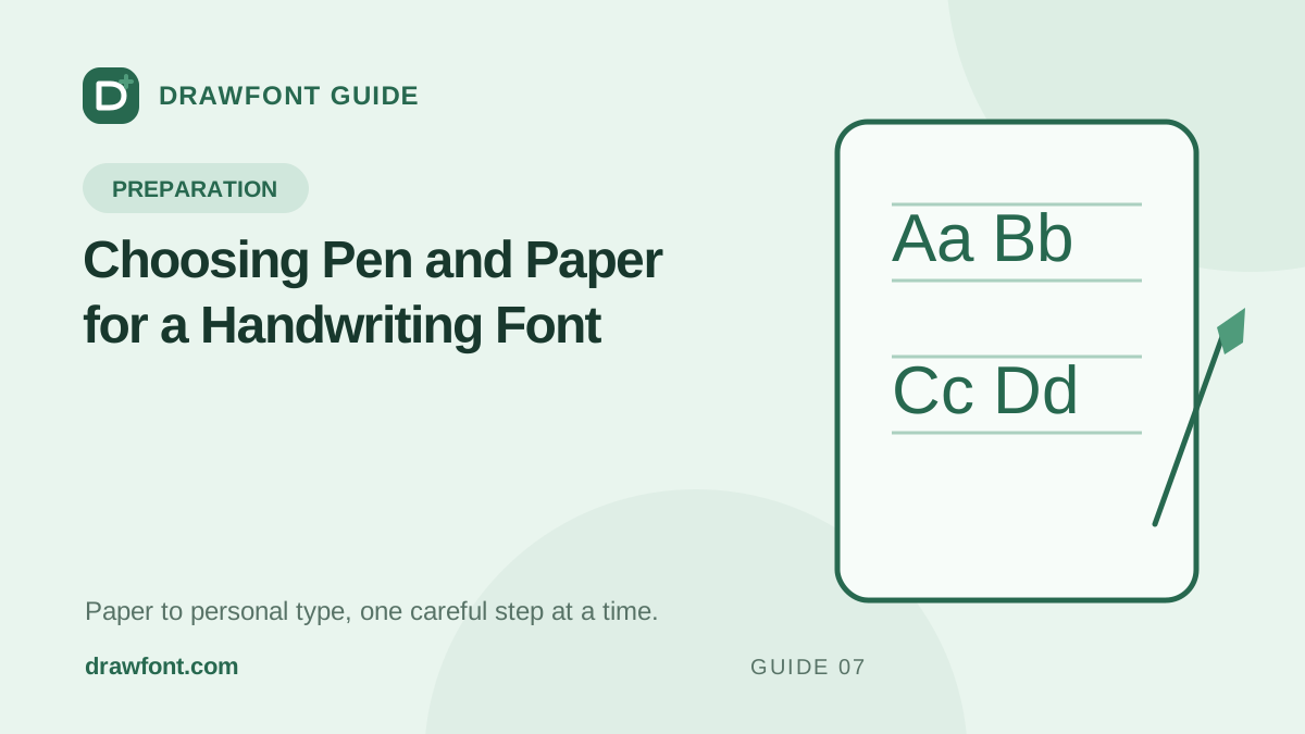
Choosing Pen and Paper for a Handwriting Font
Choose dark, consistent ink and plain paper that give a handwriting font clean strokes without glare, bleed, ruling, or lost detail.
Comparison2026/07/27
A Calligraphr Alternative for Photo-to-TTF Work
See when DrawFont is a practical Calligraphr alternative and when Calligraphr's templates, ligatures, variants, or OTF support fit better.
Troubleshooting2026/07/27
How to Fix Uneven Handwriting Font Spacing
Separate source-sheet gaps from font spacing, test real words, adjust shared metrics, and replace badly cropped glyphs without chasing every pair.
Troubleshooting2026/07/27
Why a Generated Handwriting Font Looks Jagged
Trace jagged glyphs back to blur, tiny source letters, paper noise, threshold clipping, and missing detail before recapturing or replacing samples.